Top-Up Credit Design and Impulse Purchase Psychology
Timing and psychology, not just billing mechanics, drive top-up conversions.

Credit-based pricing more than doubled its footprint across the PricingSaaS 500 Index in 2025, climbing from 35 companies at the end of 2024 to 79 a year later. Most of those companies shipped top-up flows the same way: fast, and without any behavioral framework guiding the decisions. That's backwards, and it's costing them conversion they'd otherwise keep. A top-up prompt is a growth lever disguised as billing. It's a psychological intervention fired at a user in the middle of a live decision about money and momentum, and treating it like a checkout button is why so many of these flows convert poorly or quietly burn trust. Casino chips, gift cards, and loyalty points ran this exact playbook long before software did; what's changed is the precision with which a digital product can now time and tune it, prompt by prompt, user by user.
How the double conversion separates spending from feeling like spending
Credit systems run on two conversions, and they don't feel remotely the same to the user. The first is dollars into credits, at purchase: visible, stable, something the user actively agrees to. The second is credits into tasks, at the moment of use, and this one is variable, vendor-controlled, and often opaque. Once money becomes credits, spending stops feeling like spending, the same mental accounting shift that makes windfall cash feel free to burn, or a credit card swipe feel less real than handing over bills.
A $9.99 charge for 2,000 credits reads as abundance in a way "ten dollars of usage" never will. A 5-credit charge for one action feels trivial, even when the real dollar cost is genuinely hard to work out in your head. That abstraction is the entire behavioral opening credit systems create, but it only holds if the first conversion stays simple. A dollar-to-credit ratio that shifts often, or needs a calculator to parse, breaks the spell and replaces ease with suspicion.
The risk sits squarely on the vendor's side of the ledger. Once the second conversion starts looking arbitrary, the psychological benefit doesn't fade, it flips. Users who once found the credit system freeing start treating every purchase as a hedge against getting less than they paid for, and that reversal is far harder to undo than it was to create.
Present bias and the moment a top-up prompt lands
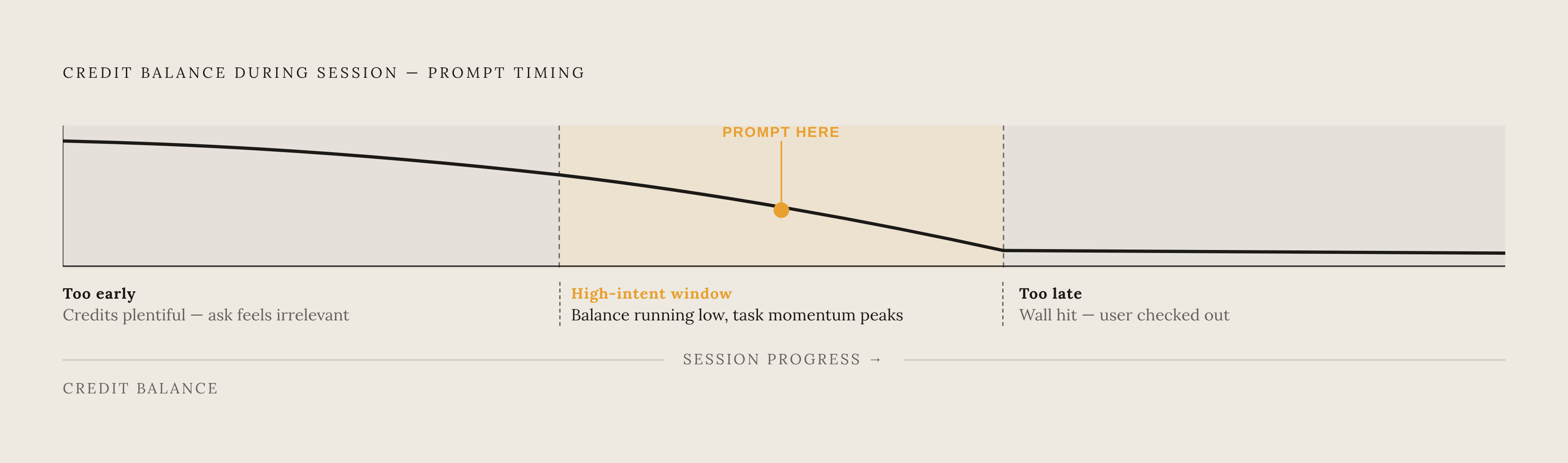
Hyperbolic discounting is well documented: people weigh an immediate reward heavier than a future cost, even when that future cost is larger and certain. Applied to credits, a user mid-task, watching their balance run toward zero, sits in a state of maximum present bias. Finishing the thing they're doing right now outweighs, in their head, whatever the top-up will cost them later. That's the moment a prompt should land, because it's the moment motivation peaks, not the moment convenient for the billing team's batch job.
A top-up prompt sitting in a weekly email digest, or parked on a dashboard tab opened twice a month, has no task pressure behind it and no momentum to protect. Conversion reflects that gap exactly. Frustration and sunk cost, the hours already invested in the work at hand, push the future financial consequence further out of mind, which is exactly why timing matters as much as copy.
None of this works without real-time metering. A billing system that only knows the balance at the end of a batch cycle cannot catch the high-intent window, because by the time it updates, the moment has usually passed. Overcorrecting doesn't help either. Prompt too early, while credits are still plentiful, and the ask feels irrelevant. Prompt too late, after the wall's been hit and momentum's broken, and the user has already mentally checked out of the task. Both failure modes cost conversion, just from opposite directions.
Denomination design and how credit quantities shape perceived value
Anchoring sets in with the first number a user sees. Show a large bundle before a small one, and the small one starts to look like a discount by comparison, even though its per-credit price hasn't moved. Layering in a middle tier compounds the effect: a well-placed middle option has been shown to lift conversion toward that tier by 30 to 40%. Three tiers is widely observed as the industry standard for SaaS pricing pages. Two feels restrictive, and four or more starts to produce the choice paralysis that stalls a purchase decision.
Denominations should map to actual task consumption, not to whatever round number looks clean on a pricing page. A bundle that runs dry mid-task creates friction at exactly the wrong moment; one that comfortably outlasts a typical session builds goodwill the vendor didn't have to pay extra for. A price like $9.99 for 2,000 credits can engage two behavioral angles at once, the intermediate-currency abstraction and the left-digit anchoring that makes $9.99 register as meaningfully cheaper than $10.
Framing matters as much as sizing. "Get 2,200 credits for the price of 2,000" lands as more generous than "10% more credits," even though the two are mathematically identical, because the absolute number feels concrete in a way a percentage doesn't. What breaks all of this is a denomination that forces mental arithmetic, credits that don't map cleanly onto tasks a user can picture. That's when hesitation creeps back in, and no amount of clever copy fixes it after the fact.
Loss aversion as the engine behind urgency-based top-up prompts
Kahneman and Tversky's finding on loss aversion holds that people feel the pain of losing something roughly twice as intensely as the pleasure of an equivalent gain. Low-balance warnings are built on exactly this asymmetry, and the best ones don't bother selling a gain. They frame a loss in which access is about to disappear, momentum is about to break, and the half-finished task is about to stall.
Credit expiry runs the same lever. Unused credits vanishing at month's end create real urgency, but only if that's disclosed clearly at the point of purchase. Sprung on the user later, it reads as a bait-and-switch instead of a deadline. Rollover credits sit on the opposite side of the coin: Lovable killed its Team plan in June 2025, then added rollover credits shortly after. Removing rollover reads as taking something away. Adding it back reads as a concession, a signal the vendor's willing to give ground on fairness.
Whether urgency reads as legitimate or manipulative comes down to one question: does the scarcity actually exist? Temporary discounts and genuine expiry windows convert because they're true. Permanent offers dressed up as "limited-time," or scarcity that isn't scarce at all, do lasting damage to credibility, and users have gotten sharp at spotting the fake version and punishing it. Bonus credits tied to a real product launch or an actual anniversary keep the loss-aversion effect intact without borrowing against trust the vendor will eventually have to repay.
What Figma's data-before-enforcement approach reveals about calibrating credit tiers
Figma rolled out AI credits in late 2025 and chose not to enforce any limits for roughly three months, letting usage run unrestrained while it collected real consumption data. The pattern that came back followed a power law: a majority of high-value customers used the AI features weekly, but a smaller subset consumed far beyond what any preset tier would have anticipated.
That's the core problem with guessing at denominations before watching real usage. A single "average user" assumption produces tiers that underserve the heaviest users and overcharge the lightest ones at the same time, because the real distribution isn't a bell curve, it's a long tail. Lovable took the opposite route, iterating roughly once a month through 2025: a Team plan launched in March, killed in June, rollover credits added in August, pricing and limits adjusted again for Pro and Business that August and into September. That's calibration under live fire rather than a structured observation window up front, and it's the riskier path of the two, because every miscalibration ships to paying customers before anyone's caught it.
Both paths land on the same principle from different directions: either gather behavioral data before setting limits, or build infrastructure that iterates fast enough to fix miscalibration in days, not quarters. Nearly half of SaaS pricing leaders report making critical pricing calls on intuition alone, and Figma's eight-month patience is the direct rebuke to that habit. Waiting cost months of unmonetized usage upfront. It was still the correct bet, and any team treating that patience as a luxury rather than a discipline is misreading what Figma actually did.
How the reverse trial and freemium entry points set up top-up behavior downstream
Reverse trials, full access first, downgrade later, produce free-to-paid conversion in the range ChartMogul classifies as "good" to "great," roughly 4 to 6% and 8 to 12% respectively. The mechanism is loss aversion again: users who've already experienced a capability fight to keep it, rather than evaluating it cold from behind a locked gate.
That same mechanism is what turns trial users into top-up buyers later. Someone who ran a project at a high credit ceiling during a trial, then watched that ceiling drop after converting to paid, feels the drop as a loss, and a top-up purchase is the most direct way to undo it.
Sizing the free grant is its own balancing act, and most teams get it wrong in one direction or the other. Too small, and the user never reaches the point of wanting more, because they never got far enough to feel the product's value. Too large, and the top-up prompt shows up before any real attachment has formed, asking for money before the user has a reason to say yes. Hybrid pricing, used by 31% of SaaS companies monetizing AI, changes the calculus further: a subscription floor lowers urgency, so a top-up prompt in a hybrid model has to sell task-level value first, rather than leading with a credit count the user has less reason to feel anxious about.
Designing the top-up prompt itself: copy, placement, and the spend-visibility requirement
Wording should describe what the user is doing. "You're about to run out of credits while generating your campaign" does more work than "Your credit balance is low," because the first ties the shortage to a task already in progress and the second hands the translating back to the user. Showing remaining credits in task-relevant terms, "3 credits left, enough for about one more image generation," gives the user a decision they can actually make instead of a raw number that needs a second conversion just to mean anything.
Spend visibility is a prerequisite the prompt depends on. It's the precondition for trust, full stop. A top-up prompt arriving as the user's first signal that anything was running low reads as punitive, not helpful, no matter how well-worded the copy is. Real-time balance displays, in-product usage graphs, and proactive alerts at 75%, 50%, and 25% of remaining balance turn the top-up moment into an informed decision instead of a crisis response.
Placement matters as much as content. A prompt should surface inside the feature the user is actively working in, never as a modal that yanks them out of one workflow to force a decision about another. One-click top-up, backed by a saved payment method, removes the extra steps present bias simply doesn't survive, since every additional click is another chance for the user to talk themselves out of it. Once the purchase clears, the confirmation should drop the user straight back into the task. The reward for buying credits is getting to keep working, not a receipt screen.
When top-up design erodes trust: the opacity and manipulation failure modes
The opacity problem lives entirely in the second conversion. If a user can't predict how many credits a task will cost before starting it, they can't budget for it, and running out mid-task generates a resentment that outlasts the session it happened in. One documented case, from The Pricing Conundrum, describes a marketing team burning through its 200-credit monthly allowance before the third week ended, after a new conversational design agent consumed credits at 13 times the rate of image generation, a rate change the vendor made without clearly surfacing it anywhere a user would see it before hitting the wall.
Changing a conversion rate without notice is close to the worst thing a credit system can do to trust. It retroactively devalues credits the user already paid for, producing the same reaction a price hike on money already spent would produce. Tropic's 2025 spending trends report names this pattern outright: "credit-based obfuscation," where vendors moving from per-seat to credit pricing make true costs harder to see and benchmarking against competitors nearly impossible. Buyers are actively watching for it now, and that's a shrinking window for anyone tempted to use it.
The population of skeptical buyers keeps growing, and for good reason. Top-up design that leans on opacity to convert might close a sale once, but it's a bad trade even on its own terms: it accelerates churn and drives up support costs, because the user who got burned tells the next one.
The billing infrastructure requirements that make behavioral design executable
None of the behavioral design described above works without infrastructure built to support it. Precision-timed prompts, real-time balance displays, task-level credit estimates, all of it depends on metering that knows the current consumption state, not the state as of last night's batch job. A system that updates once a day cannot catch a high-intent window that opens and closes within minutes, no matter how well the copy inside the prompt is written.
Credit wallets have to handle prepaid and postpaid mechanics at once, since some users top up as they go while others run against committed volume or a subscription-plus-overage arrangement. Those are different behavioral designs, and forcing them through separate codepaths turns every future change into an engineering project instead of a product decision. Rollover rules, expiry logic, bonus grants, tier recalibration: all of it needs to be adjustable by product and finance teams directly, without a ticket to engineering. Companies making multiple pricing changes a year, and industry data puts that average at 3.6, can't afford to wait on a sprint cycle every time a tier needs adjusting.
Spend visibility, the real-time dashboards, the in-flight alerts, the consumption history, is core infrastructure for financial control, and it's the reason a user trusts the top-up prompt instead of resenting it. As AI products start billing across tokens, model tiers, feature types, and hardware configurations all at once, the number of credit-to-task conversion rates in play multiplies fast, and the infrastructure has to model all of them without someone reconciling the numbers by hand at month's end. Every idea in this piece, the timing, the denominations, the loss-framed copy, is only as good as the system's ability to execute it in real time. Teams running on fragmented billing logic, patched together and reconciled by hand, aren't in a position to ship the kind of precision this purchase psychology demands, and no amount of clever prompt copy closes that gap.